Friday 4 May 2012

Evaluation Q7

Looking back at your preliminary task, what do you feel you have learnt in the progression from it to the full product?

Preliminary task:


The final product:


What I learnt:


There was no need for audience research or planning the preliminary task as this was just a test subject to get a picture of how it would be working with Photoshop. But for the final products the research and planning was essential to know what key elements a music magazine would need and look like to draw an audience. Through the process I working with different softwares and hardwares technologies were I have developed skills and got a better understanding how complicated making and selling a music magazine would be. It's so much more to making a magazine than my original thoughts of just making a magazine and sell it through retailers, there needs a lot of research. Research of what the audience would want to read about at the time the magazine not is made but is publishes, the producers always needs to be one step before the reader to maintain their interest. In addition they use a lot of time researching and planning how the smallest details in a magazine could attract or address the audience. It's a much harder and complicated process than I had imagined, and I must say i'm deeply impressed of all those who do this for a living.


The photoshop tools


When I did the preliminary task it was my first time ever to work with Photoshop. As a result I used a limited amount of tools, as i didn't know their proper functions. This naturally is very noticeable to see on my preliminary task. However through working with both the preliminary task and a lot with the final products I developed my skills as I went on. In the end I was able to use more tools, settings and short cuts to make a product that i'm now very pleased and happy about. I find it interesting how technology can so easily be played around with, changing colours, making layers, croping and moving things around to make a magazine so alike to a real one.


The places marked with a red ring on the skill map, is the skills I feel I have developed throughout this whole process. Which are skills that can also be useful in later events.
All in all, I found this coursework demanding and hard but at the same time it was fun and exciting working with something throughout all the different processes. In addition I learnt a lot about research, planning, technical aspects and aesthetic. 

Monday 20 February 2012

Final Pages

I'm very pleased with my final pages.
Front cover
This is the Front cover I ended up with. It is drawing lines back to the front cover analysis’s I did, especially NME’s front cover. The similarities are shown though the strong cover photograph and the minimalistic use of text.
The cover maintains a simple look with open spaces and few colours – white and black. The ratio of image and text is in context with one another, whereas the person in the picture is directing the readers the attention further from the image to the text with her hands.


Contents page
For my contents page I wanted to have several pictures with a cover line underneath each image. The purpose was to have various pictures with a different use of mise-en-scene and different editing’s.  For each photograph I have used a unique font, which I thought matched the photograph. Therefore there are several fonts, which are connecting to the images in their own unique way.
I understood by the survey that my audience was most keen on having a contest in the magazine where they could win concert tickets. 


Double page spread
For the double page spread I wanted the picture to go over the whole left side, whereas the person in the picture needed to have a strong posture that would use approximately the whole left page. I have made the ground that was on the image go over to the left side connection the to pages. The other pictures I have used are one of her mouth with red lipstick where she is “saying” a quote that is located on the right side of the picture. The third picture on the page is of her feet with a tattoo quote that is in the text and her red shoes. So the red, black and skin tones are repeating though the page. Again I got the inspiration for the design from NME but this time their dps. 

I had so much text for my dps, so I had to make an extra page.
For my second double page spread I used a photo from the same photo shoot as the front cover photograph – having the same mise-en-scene except from the composition. Now the photo is taken from a shot that contains her whole body, with a quote over her head – as if she is thinking the quote.

I have a layout of 4 columns going down each page. 

Final written article

Arianrhod is the biggest upcoming artist for the New Year and has America at her feet. So where do all the emotions her songs are filled with come from?

As Arianrhod steps into the room, dressed cool and relaxed in a maroon shorts, a black top with several long necklaces, bracelets and rings, she comes straight over to greet us with a warm hand and a welcoming smile. We make our introductions, and take our seats around the table.
“My crew and me want to thank you for agreeing to personally introduce us, InD to the person behind the music.” I say. Arianrhod says it’s about time she tells her story and set the rumours straight.
“Well it all started when sister Lucy was 6 years old and got acute promyelocytic leukemia, which is a blood and bone marrow cancer. She was dying and the only way to save her was by conceiving a saviour sibling, in order to use the blood and other body substance in treatments. Which is why I was conceived, even if it meant for me not being able to have a normal life, play sport or any other sort of activity that might be too rough. Lucy continued to swing between remission and relapse the next years. I was 12 when Lucy first told me that she didn’t want me to donate any more on her behalf but wanted me to have a life on my own. Knowing that if I stopped donating my sister would eventually die within a short time period, I refused to do what she asked of me. Instead I found a hobby that didn’t require any physical activity to show her I could manage fine as a donor, so I started playing the guitar. A year later she woke me up really early one day to show me she had made a picnic for us in the sun, that’s when she told me she couldn’t bear going in and out of the hospital any more. She had had enough, Lucy said that I was her only hope since she knew our mother would never willingly give up without a fight. I remember the sun shining on her face when she was saying that it was her time to go now. I cried for week knowing the consequence of going though with what she wanted, I loved her so much but if this was what she truly wanted how could I refuse. So in the evening on the same day I told my mother I didn’t want to donate any more. At first she just laughed at me, but when she realising I meant it she got furious and scream awful things like “Do you want you sister to die?!” and etc. It was horrible but the thing that kept me going was that I knew I was doing it for my sister, it’s what she wanted. About 4 moths later my sister got really bad, she got admitted into the hospital where she lay weeks before the day came that we all knew would be the last. It’s truly the worst day of my life, seeing my sister so weak she could barely speak or move. It was never the same after my sister died. My mother kept blamed me for Lucy’s death even when I told her the trut, she just said you should have refused, then she would be alive now. My dad started drinking and my mother followed soon after. It was a mad house, the only thing that made me able to shut the world out was playing my guitar. It reminded me of my sister, I used to play and sing to her every day at the hospitals. That’s where my songs are from, the love I shared with my sister. We had so much fun fiddling around with lyrics, making our own songs, making angry, sad and happy songs all depending on our mood. We loved hearing the artistic sound of the guitar to our voices. When I was 16 I moved into an apartment with my best friend Alex Mangfield, who was the one supporting me with a career in music. He got me in touch with an old friend of his father who runs Release, the record label I’m now releasing my second album with, “When her heart stopped”. Andrew Filton, the label president, knew I was a long shot but took a chance and I think he is quite happy about it today.” She laughed but turned serious again and said that all her music is dedicated to her dear sister Lucy.
The room turned quiet, I think we’re all pretty shocked. I told her that I never though her adolescence was that hard and that I’m so sorry about her sister and how her parents treated her afterwards. She answered ‘Que sera sera’ which means ‘whatever will be, will be’ which she said was something her gandma always used to say about life. So with good help from her friend Alex, Arianrhod managed to turn her sorrows, anger and love into something good, into good music. Arianrhod say with a smile on her mouth that she doesn’t know what she would have done without him.
I nod my head understandingly while saying that he sounds like a true friend, and a real keeper! We wrap up the interview and thank Arianrhod so much for sharing her upbringing with us especially knowing know how hard it must have been. We share hugs and say our goodbyes leaving with a more open and understanding sight of the world and the difficulties in it. We all agree on that Arianrhod is truly a strong person going though all that and being where she is today.

Friday 3 February 2012

The written article so far

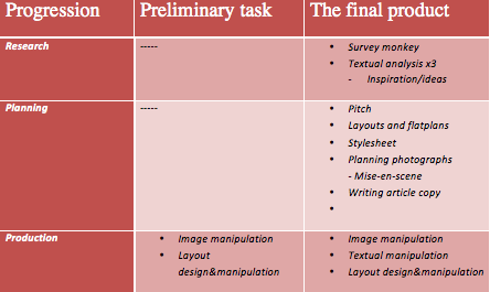
The written article for the DPS

Arianrhod is the biggest upcoming artist for the New Year and has America at her feet. So where do all the emotions her songs are filled with come from?

As Arianrhod steps into the room, dressed cool and relaxed in a maroon shorts, a black top with several long necklaces, bracelets and rings, she comes straight over to greet us with a warm hand and a welcoming smile. We make our introductions, and take our seats around the table.
“My crew and me want to thank you for agreeing to personally introduce us, InD to the person behind and before the music. That is truly a question everyone one wants an answer to, so we feel very lucky” I say. Arianrhod agrees as she says its maybe about time she tells her story and set all the rumours straight.
“Well it all started when my dear sister Lucy was 6 years old and got acute promyelocytic leukemia, which is a blood and bone marrow cancer. She was dying and the only way to save her was by conceiving me as a savoir sibling, in order to use my blood in her treatments. The treatments initially were successful, but Lucy relapsed and I, as the only compatible family member, had to be used as a donor for any other body substance needed to treat Lucy, even if it meant for me not being able to live like a normal kid, play sport or any other sort of activity that might be too rough. Lucy continued to swing between remission and relapse the next years. I was 12 when Lucy first told me that she didn’t want me to donate any more on her behalf but instead wanted me to have a life on my own. Knowing that if I stopped donating my sister would eventually die with in a short time period, so I refused to what she asked of me. Instead I tried finding hobbies that didn’t require any physical activity to show her I managed fine as a donor, so I started playing the guitar, and I was actually really good. A year late she woke me up really early one day to show me she had made a picnic for us in the sun, that’s when she again told me she couldn’t bear going in and out of the hospital any more. She had had enough, Lucy said that I was her only hope since she knew our mother would never willingly give up without a fight. I remember Lucy sitting on the banquet, sun shining on her face when she was saying that it was her time to go know now. I cried all day knowing the consequence of going though with what she wanted, I loved her so much but if this was what she truly wanted how could I refuse. So in the evening I told my mother I didn’t want to donate any more. At first she just laughed at me, but when she realising I meant what I said she got furious and scream awful things like “Do you want you sister to die?!” and etc. It was horrible but the thing that kept me going was that I knew I was doing it for my sister, it’s what she wanted. About 4 moths later my sister got really bad, she got admitted into the hospital where she lay weeks before the day came that we all knew would be the last. It’s truly the worst day of my life, seeing my sister so weak she could barely speak or move. It was never the same after my sister died. My mother kept blamed me for Lucy’s death even when I told her what my sister had asked of me, she just kept on saying you should have refused, if you had she would be alive now. My dad started drinking as well as my mother started soon after. It was a mad house, so I was happy for the time I got away for my guitar lessons, which soon went to an ended since my parents stopped paying the bill. The only thing that made me able to shut the world out was playing my guitar. It reminded me of my sister, I used to play my guitar and sing to her every day at the hospitals. That’s where my songs are from, the love I shared with my sister. We had so much fun fiddling around with lyrics, making our own love songs pretending to be somebody else, making angry, sad and happy songs all depending on our mood. We loved hearing the artistic sound of the guitar to our voices. When I was 16 I moved into an apartment with my best friend Alex Mangfield, who was the one supporting me to a career within music. He got me in touch with an old friend of his father who runs Release, actually the record label I’m now realising my second album with, “When her heart stopped”. Andrew Filton, the label president, knew I was a long shot but took a chance and I can’t think he regrets that choose today. She laughed but turned serious again and said that all her music is dedicated to her dear sister Lucy.”
The room turns quite after Arianrhod’s stops speaking, I think we’re all pretty shocked. I tell her that I would never have though her adolescence was that hard and that I’m so sorry about her sister and how her parents treated her afterwards. She answered that having to know your conceived for your sisters need is not easy, but I never blamed her or my parents, they where desperate. What I couldn’t cope with was the fact that my mother blamed me for my sister’s death. I loved my sister so much and then having to hear that I was to blame for her death was unbearable. I barely survived the last year living there but luckily I got out and when I did I promised my self I would never go back to them and I’ve kept that promise. With good help from my friend Alex I have managed to turn my sorrows, anger and love into something good, into good music. I don’t know what I would have done with out him.
I nod my head in understanding while saying that he sounds like a true friend, and a real keeper! We rap up the interview and thank Arianrhod so much for sharing her upbringing with us especially knowing know how hard it must have been. We give hugs and say our goodbyes living with a more open and understanding sight of the world and the difficulties in it. We all agree on that Arianrhod is truly strong person going though all that and being where she is today.


Quotes:
“I wouldn’t be her today if it wasn’t for my sister”
“Use your head and follow your heart”

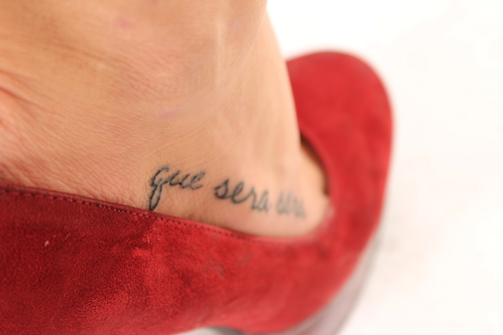
Tatto picture meaning:
"What will be, will be"

Wednesday 1 February 2012

Initial and final drafts & Plans for photography - Double page spread

 
I have based my drafts on the NME’s double page spread.
For my DPS I tried different themes and seasons, wanting maybe to take my main picture in snow but I changed my mind and wanted there to be a connection between the front cover image and the dps main image, therefore I decided to take both photo shoots in a studio.
I found that I very much liked the simplicity of NME’s dps where there is one big photo of Florence covering the whole left side page and is overtaking as the background for the right side. So I decided on a layout that would have one big picture going over the whole left side, where the person in the picture how have to use the space with her body – leaning to one side, sitting on a chair, or having her hands to her hips with her feet firmly to the ground.

The right side of the dps would consist of 4 columns going down the page, where there would be one picture covering the bottom of the 2 first columns and another picture on the top going over the third and forth column. There might be a quote on the bottom of the third and forth column referring to the picture that is on the bottom going over column 1 and 2. There will an index on the top going over column 1 and 2 in bold letters.
The masthead will begin in the end of the left side page and go over to the right side.

Initial and final drafts - Contents

I made several drafts for my contents page but decided on the one to the left, the one that has the arrow towards it. The design has lots of pictures, I’m thinking about 6 pictures and one of them being of the editor and the others of different articles and sections within the magazine. I want maybe quotes and some summarising text about the article with a page number, with different fonts connecting to the different pictures. I was also thinking about having a contest or an intro to a contest in the right bottom side corner, and in the right side corner more about what are inside the magazine. I want the masthead to be big and easy to read. I want the pictures to be different from one another, some in black and white and some in strong colours and some simple but with a strong look. I want all from coloured clothing to a simple white or black dress.

Initial and final drafts & Plans for photography - Front cover

1.  
2. 
I have based my drafts on the NME and the FOAM front cover.
The top picture on Image 1 and the picture to the left on image 2 is my own version of NMS strong cover, it’s very simple but with a powerful look it strengthen the person in the picture, where the cloth also reflects back at the persons personality and in on way to her music genre – as rock artist will wear mostly black and red, indie – more down to earth or with one strong colour that stand out.
Picture in the middle of both image 1 and 2 is basically almost the same as the image above and on the left, but it is taken from an low angle empowering the person in the image, her eyes are closed  as well as the person is crossing her hands over her shoulder, shielding herself from the world. Wearing cloth that reflects back at the persons personality
Picture on the bottom of image 1 and to the right in image 2, is the same idea as the FOAM front cover was. The person in the picture standing front faced to the left and the cover lines etc. To make the image more powerful the person is holding her hands on her hips, making a strong statement though her body language.
I decided on something in between the two first pictures I described. Therefore I ended up with a picture from a low angle where the person is crossing her hands over her shoulders – a body language that in a way shields her from the world but also means love in sign language. As the image is with an low angle it gives her a reflection of power, as she is almost looking “down” on the person on the other end of the camera or magazine, simple but also strong with a powerful facial expression and cloth that reflects back at the persons personality and music genre. The person in centred in the middle of the image, her hands shielding herself but also creating a line and symmetry in the picture by the articles being were her hands are pointing. As well as the main article is where her elbows are crossing, which is something ‘exclusive’ about the person in the picture.
 

Monday 30 January 2012

The double page feature my magazine

The feature for my dps will be about how a young girl, soon to be 18, who as had a tragic and hard adolescence has now become the biggest upcoming artist for 2012.


The index of the article:
 Arianrhod is the biggest upcoming artist for the New Year and has America at her feet. So where do all the emotions her songs are filled with come from?


Some of the pictures taken for my dps:


The style/look

I want the magazine to look very delicate -simple but strong, similarities to both NME and Q. It is inspired by the design of both those two magazine layouts but also an online indie magazine. http://www.indiego.at/ The style and look of the magazine is not only based on the ratio and location of text and picture on the page but it is also a lot of weight on how the picture looks, by using mise-en-scene. The inspiration for both the indie style and design is therefore coming from several places; NME, Kerrang!, Q, http://www.indiego.at/ and a indie blog http://thepetfanclub.blogspot.com/.
So I want my front page to be powerful, similar to the NME front cover I analysed, as well as I want my dps to be slightly similar in proportion to the NME’s dps – it comes back to simple but powerful. And for my contents page I want it more like Q’s contents – lot of pictures as well as information on what the picture is of and what is further inside the magazine.

My target audience

Lilly is 19 years old and has a deeply passion for fashion as well as for music. When she was about 15 years old she started reading music magazine discovering artist, band and different genres of music. As she grew older she developed a certain interest for Indie Pop and Indie Rock and the fashion that followed. She started buying several magazines containing this genre, reading the magazine from start to finish, also finding her favourite artist within Indie, who she followed by internet and twitter and of course had all their songs on her IPod. The fashion within this genre inspired her, so she started sowing her own cloth, similar to the ones she saw in the magazines and those she saw on the Internet of what they were wearing to all from concerts to on a daily basis. Lilly really like making her own clothes and accessories - she liked her individuality and she were also really good at it.
Therefore choose to study further at Leeds university, where she could both get the music as well as the fashion. Lilly is now living and breathing music, going to gigs, hearing the music as well as having an eye open for inspiration for new designs for her clothing line. She is still reading several music magazines a month and uses her music 24/7 for both pleasure and inspiration. 
                             
Pictures from http://www.indiego.at/ 


The name of my magazine

Since the magazine is based on the indie pop genre I was thinking of names reflecting back to the music type which would make it easy for my readers to understand the genre of the magazine. My thoughts around a name went all from “Creation” with the C in big and bold letters but with some suggestions I ended up playing around with the word Indie. Where I ended up with the letters InD, with the i in the beginning highlighted with big bold letters, as the D follows the i in same size and font where the N is the placed either inside the i letter or the D letter in white. 
This is what I ended up with: 


The style of music

 My magazine’s music genre is Indie Pop and Indie Rock, which I have chosen as it is one of my own personal favourite music genre. The design and style is based on information found on Internet and gathered through research and analysis of NME, Kerrang! and Q. I personally think of Indie Pop/Rock as an alternative music which can both be very aggressive but also very tranquil. I like that every song has a story or a meaning behind it, matching every mood I might be in. As well as the fashion within Indie, simple but with certain details to the outfit. 


Style sheet

The style sheet i've made shows what types of fonts, type of photography and what colour scheme i plan to use in my magazine. I want my masthead to be simple but stand out so it is easy to see, therefore i have chosen helvetica in bold. I want the front cover to be keept clean and simple with minimalistic colours (cream white, peach and gray) and with simple fonts so the concentration and attention will be dragged to the picture. On the contents page, i want to use many different colours as well as many fonts that should create a connection between the font and the image. I.E. Two guys posing to be "bad ass" - i would use more a bold and hard font to reflect on their "hard" attitude. I want the double page spread to be simple with mostly use of red, white and black. Simple pictures with attitude and a simple font for the text. 

Secondary research - Media packs

NME
With the information from Nme’s media pack I found out that their main reader is male with an average age of 25, matching their target market, which is male 17-30. Their readers are attracted to the magazine as 80% of them feel that music is an important part of their lives, where NME introduce them to new artist, bands, albums etc. They know that another way to attract a wider rage of readers is to widen the information they give though the magazine; by listing the new and upcoming artist with the magazine genre, also having old and original artist with their biggest hits or their newest song, building the readers knowledge and interest to know either more about the artist or hearing about them for the first time. Another way the attract readers is giving information of upcoming concerts and articles about past.  As 26% of their readers are students and 34% are working full time they have to find a balance between giving the students articles and news that they will find as interesting as a full time worker will.  Other information from NME’s media pack show us that their readers are also very faithful to the magazine, by 62% reading at least 3 out of 4 issues and 49% have been reading NME for at least 3 years. Concluding, 84% of their readers find that the magazine gives them what they want and therefore give it an average of 46 minutes reading each issue.

Kerrang!
With the information from Kerrang!’s media pack I understand that their way of attracting readers is their way of being an integral part of the scene rather than just commentating. Their also aiming for a age group that is rather hard and expensive to reach but as well as their magazine not only brings the reader information about music but also films, games and further technology they build a wider rage of interest for the different readers. They balance their magazine to contain of bands and scenes that will appeal to different types of readers in different age groups, as to give the reader variety, news of their favorite bands but also introducing them for new artist and bands. Kerrang! is known by its reader it be especially concentrating on rock music and rock gigs etc. It is the biggest weekly music magazine in the world and they have a enormous readership of 421,000 people where 70% is solus readership.

Q
With information from Q’s media pack and by looking at the design of the magazine it is easy to understand and see that they aim for a different and more sophisticated age group than NME and Kerrang! is targeting. Their median age is 29 years old. Something all the magazines has in common is that they main reader and main target is male, which 68% of Q’s readers are male. Which isn’t such a high number compared to NME for example, who has a male percentage of 74%.  Otherwise Q is uk’s biggest music magazine, having influence and trust in their shaping the readers view of artist and scenes.  As I mentioned before their magazine style is very sophisticated, with award winning photographs, best interviews and writing. Further seen when they describe a functional target audience, who is 29 years old male figure who got inspired by music in the mid-‘90s, by artist like Liam and Noel, Blur and the Britpop scene. As well as knowing his type of music genre and favorite artist, buying up to 6 albums a month, also being open for new artist and bands represented from his trusting source, Q magazine.